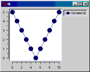
Once you have all the required packages installed, this fully functional plotting-program may be run by writing "python HelloWorld.py" on the command line (provided the example is called HelloWorld.py) the result will be something like shown in the picture.
The code should be rather self-explanatory, but since this is the first example, we shall explain each line in the source code:
- Line 1 imports all the functionality needed for the Tkinter package, which is a popular graphical user interface (GUI) development tool originally written in Tcl and ported to Python.
- Line 2 imports Python megawidgets which is an extention to Tkinter. This package contains a lot of fancy GUI stuff and is needed in order to display the plotting area.
- Line 3 builds the basic GUI. A small window with a default title "Tk" is generated and displayed. We shall place our graph in this window.
- Line 5 generates a graph object and tells it to take place within our newly generated window.
- Line 6 tells the graph how to behave within the window: It should be allowed to fill all the available space.
- Line 9 creates a vector, actually a Python tuple, of x-coordinates. You can alternatively use a Pmw.Blt.Vector object to store your data. In practice this will be more convenient since changes to a Pmw.Blt.Vector are automatically updated in the graph. (BLT vectors are, however, slower than tuples.)
- Line 10 creates the tuple of y-coordinates. These are computed from the function f(x)=abs(x-5). Of course, any set of coordinates could be entered.
- Line 13 inserts a graph into the plotting area with a label, x data, and y data.
- Line 15 gives control to the Tkinter-package, which enters an event loop and waits for user input.
Hello BLT
 Let us move on to a little more advanced example. First take a look at the
source code for the Hello BLT example. If you run
this program, the result will look something like the picture shown below,
except that some adjustments are made to make it more presentable on the
Internet.
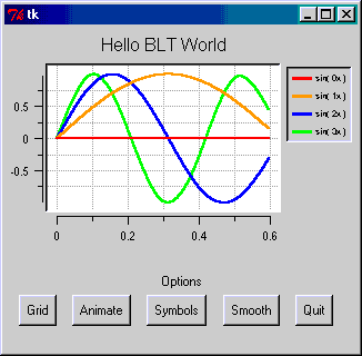
Let us move on to a little more advanced example. First take a look at the
source code for the Hello BLT example. If you run
this program, the result will look something like the picture shown below,
except that some adjustments are made to make it more presentable on the
Internet.
In this example, the data to be visualized are stored in Pmw.Blt.Vectors. These are convenient for animations, because, when using using Pmw.Blt.Vector, changes to a vector are automatically updated in the graph, a feature that makes animations simple to code.
In the line_create(...) call, optional parameters are set for specifying the colors of the curves, a line thickness of 2 pixels, and no symbols (small disks at the data points included by default).
In order to demonstrate the main difference between a normal plotting program and the Pmw.Blt utility, namely the ability to add a custom user-interface, we have also included a row of buttons which lets the user control some parts of the graph:
- Grid turns grids on and off. This is done simply by binding the method grid_toggle(...) to the button labeled "Grid".
- Symbols can be pressed to hide or show symbols (small disks) at the actual coordinates. This is done by binding the function symbolsOnOff(...) to the button "Symbols", and letting the function alternately call element_configure(...) with parameters symbol="diamond" and symbol="".
- Smooth works in the same way, except that it has four states, and specifies the graph's degree of smootheness. In any case the points on the graph are connected using splines, but you can choose between degree 0 to 3. They are called "step", "linear", "quadratic" and "natural". The graphs in the snapshot has been drawn with only 7 coordinates for each graph, but since natural splines are used to connect the points, the graphs still look smooth and "sine-ish".
- Animate demonstrates that you can easily turn your graphs into an animated movie, or perform other types of animations. In the current example, pressing the button will draw the graphs f(x,t,n)=cos(nx+t) where n is the number of the graph, x is the value along the x-axis, and t is the time. This is done easily by repeatedly updating all the y vectors, waiting for a short time period using the Tkinter method after(...), and updating the screen, using the Tkinter method update_idletasks(...).
- Quit simply calls the Tkinter method quit(...), which stops the program.
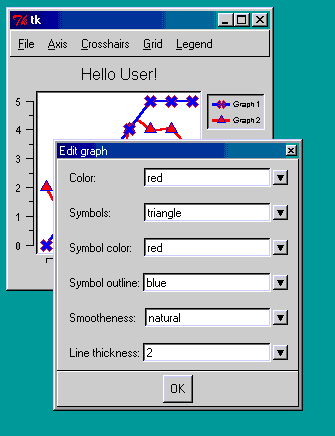
Hello User
Pmw.Blt is ideal both for small specialized plotting tasks and for creating full-fledged user-friendly and flexible plotting program. Let us indicate how one can make a plotting program with menus that allows reading data from files, setting up grids, labels, axes, colors, symbol types, line thicknesses, smoothing properties and so on for each curve. In addition we also enable the user to save the resulting plot as a postscript file.
Making such a program is a rather straightforward process.
Even with sophisticated
interactivity like double-clicking the graph to edit its properties, checkbox menu-fields,
and drop-down combo boxes to select colors and symbols,
the current uses than four lines of code per selection available to the user.
Before we start the discussion of the program, you should take a look at
the Hello User source code, or preferably,
open it in a separate window.
The easiest way to get familiar with the program, is probably to start where the menus are generated (search for the line "# Make the File menu" in the source code).
The first line of interest is the line where the File|New menu item is generated. Each menu item is bound to a function. In this case, it is the newFile function. If we look at this function, we see that the only thing it does, is deleting all the existing graphs. This is done by retrieving all the graphnames using the element_names() function, and calling element_delete for each graphname.
The next menu item, File|Open, calls openFile when selected. This function opens a file dialog, and lets the user select a file to load. The file must consist of one graph coordinate per line, with the x- and y- coordinate separated with comma. The coordinates are read into two lists, vector_x[i] and vector_y[i], and then inserted into the graph with the line_create(...) method. In addition, we use element_bind(..) to tell the graph to call the function graphSetup(...) each time a graph is double-clicked.
When a graph is double-clicked, the graphSetup(...) function must first decide which graph was double-clicked. This is done using the element_closest(...) method, which finds the graph that is closest to a given point - in our case the coordinate of the mouse-click: (args.x, args.y). Next, a Pmw.Dialog() is generated, and filled with combo boxes showing the graph's current settings (color, symbol, symbol color, outline color, smootheness and line thickness). The settings are retrieved with the element_cget(...) method (in the cBox function). Finally the new values are put back into the graph using the element_configure(...) method.
Let us go back to the File menu. The next menu item is the File|save as ps item. This menu item calls the postscript function, which in turn calls the postscript_output(...) method. Even though numerous arguments may be passed to this method, a filename, and decorations=no is normally all that is needed.
We leave the File|Quit menu item as an excercise ;-) and move on to the next menu: the "Axis" menu. The first menu item, 'hide', will toggle the axes on and off. The next two items controls whether the x and y axis should be logarithmic or linear, and the last item inverts the direction of the axes. All these menu items depend on the axis_cget(...) and axis_configure(...) methods. But be aware that the axis-methods comes in two flavours: To hide the x axis, you can either write g.axis_configure( [ "x" ], hide=1 ) or g.xaxis_configure( hide=1 ). You will use the more general g.axis_configure(...) when you want to set up several axes at a time or an axis other than the default x, y, x2 and y2 axes.
The Crosshairs menu lets the user turn crosshairs on and off, and choose between 5 colors for the crosshair. Crosshairs is a cross which has its center at the mouse location, and extends over the entire plotting area. This makes it easier to decide the coordinates of a point on the graph. The crosshairs options are read and set with the crosshairs_cget(...) and crosshairs_configure(...) methods. Note also that the crosshairs is not necessarly bound to mouse movements. This is controlled by the programmer. In our case, each time the crosshairs is set to be visible, we bind the function mouseMove to mouse movement events, and when the crosshairs are hidden, we remove the binding. The function mouseMove will, on each call, use crosshairs_configure(...) to move the crosshairs so that it follow the mouse.
The next menu is almost identical to the previous one, except that it handles the grid rather than the crosshairs. Again, the user can turn the grid on and off, and choose among 5 different colors for the grid. And - not surprisingly - the grid options are read and set with the grid_cget(...) and the grid_configure(...) methods.
Finally, we treat the Legend menu. This menu gives (of course) the user the possibility to show and hide the legend, and in addition, he may choose its relief, which may be one of "sunken", "flat" or "raised". Needless to say, the Legend options are read and set with the legend_cget(...) and the legend_configure(...) methods.